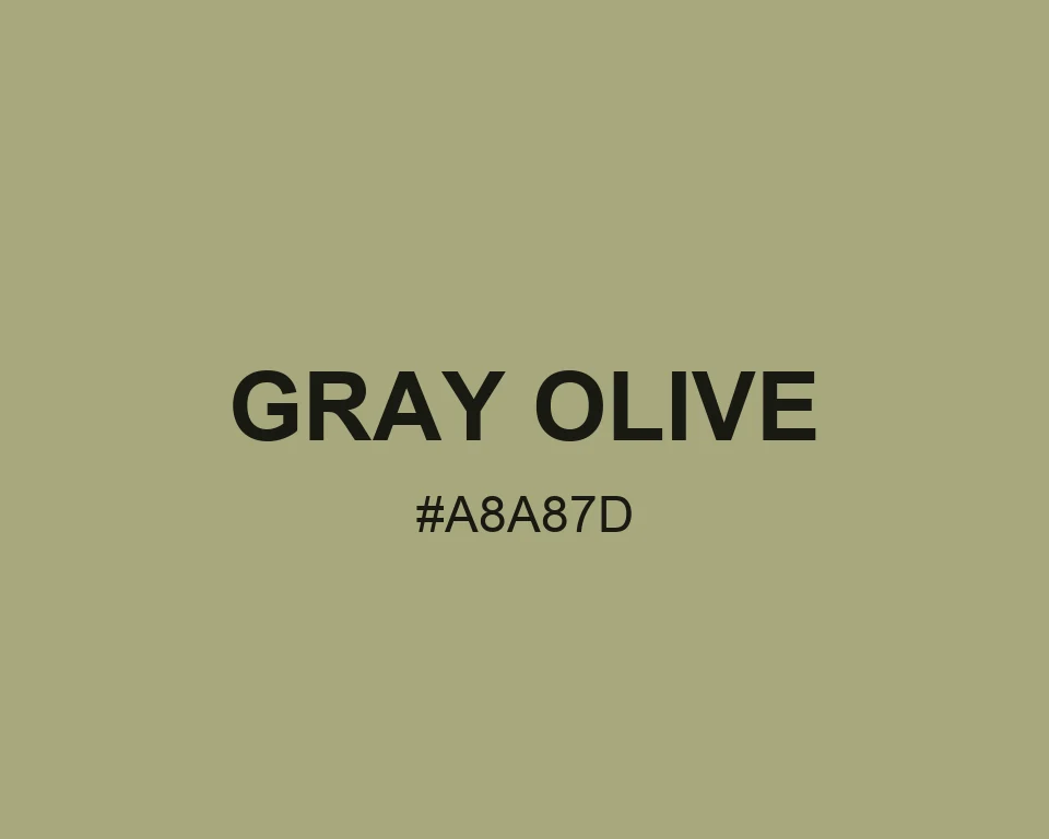
Gray Olive feels like a painted cabinet that has seen a few summers. It is neither fully green nor fully gray, which is exactly the point.
It settles busy layouts because it carries low contrast without looking blank. Use it for secondary surfaces, data labels, or calm editorial color blocks.
Neutrals Colors and Muted Colors explain its role better than bright green families do. A pale cream lifts it, while a slate blue makes the olive note easier to see.
Tints
#B1B18A
#B9B997
#C2C2A4
#CBCBB1
#D4D4BE
#DCDCCB
#E5E5D8
#EEEEE5
#F6F6F2
#FFFFFF
Shades
#979770
#868664
#767658
#65654B
#54543E
#434332
#323226
#222219
#11110C
Triadic colors
#A8A87D
#7DA8A8
#A87DA8
Monochromatic colors
#C4C4A7
#A8A87D
#727255
Analogous colors
#A8947D
#A8A87D
#94A87D
Complementary colors
#A8A87D
#7D7DA8