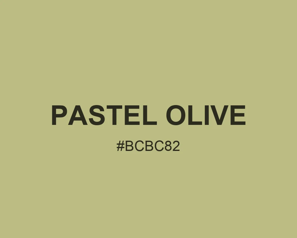
Pastel Olive
A warm olive with the faded look of a painted ceramic glaze.
Color Conversions
| Color model | Value |
|---|---|
| HEX | #BCBC82 |
| RGB | rgb(188, 188, 130) |
| HSL | hsl(60, 30%, 62%) |
| HSV | hsv(60, 31%, 74%) |
| CMYK | 0%, 0%, 31%, 26% |
Real Design Examples 👇🏽
Color Combinations
Quiet field notes
#BCBC82
#E1E1C7
#3E4530
#F3EFE3
Earth and shadow
#BCBC82
#645403
#B9A47C
#EEE4D1
Cool counterweight
#BCBC82
#5E7180
#D9E0D5
#293534
Patterns
Best Match
Pastel Olive is the quiet one in a yellow-green palette. It reads soft first, then slightly earthy once it sits beside white.
It works well for stationery, subtle charts, and background panels that should feel warm without becoming cream. Blue-gray details give it a clean edge.
Soft Colors and Muted Colors suit its temperament. Pair it with slate or a faded terracotta when a composition needs a little tension.
Tints
#C3C38E
#C9C99B
#D0D0A8
#D7D7B4
#DEDEC0
#E4E4CD
#EBEBDA
#F2F2E6
#F8F8F2
#FFFFFF
Shades
#A9A975
#969668
#84845B
#71714E
#5E5E41
#4B4B34
#383827
#26261A
#13130D
Triadic colors
#BCBC82
#82BCBC
#BC82BC
Monochromatic colors
#D1D1AA
#BCBC82
#808058
Analogous colors
#BCA182
#BCBC82
#A1BC82
Complementary colors
#BCBC82
#8282BC