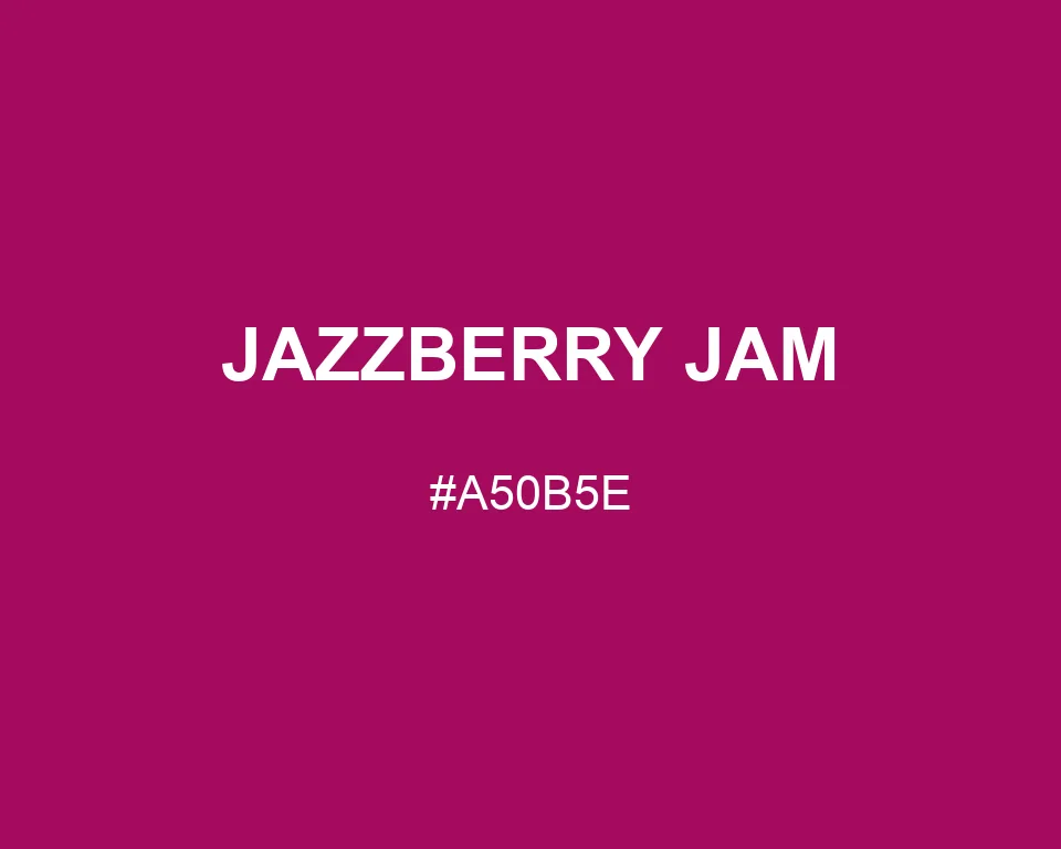
Jazzberry Jam
Tints · 950
Jazzberry Jam
#A50B5E
HEX
Tone scale
Tints
Color Conversation
Color harmony
Accessibility
Aa
FailDark text
2.24:1
Aa
AAAWhite text
7.47:1
Jazzberry Jam
Tone scale
Tints
Color Conversation
Color harmony
Dark text
2.24:1
White text
7.47:1
Jazzberry Jam #A50B5E behaves more like burgundy than candy pink. Its magenta direction appears once lighter colors sit beside it.
| Color model | Value | Common use |
|---|---|---|
| HEX | #A50B5E | Web and interface color |
| RGB | rgb(165, 11, 94) | Digital screens |
| HSL | hsl(328, 88%, 35%) | Hue-based adjustments |
| HSV | hsv(328, 93%, 65%) | Color pickers |
| CMYK | 0%, 93%, 43%, 35% | Print reference |
#a50b5e
#777d35
#c5c88b
#fff4dc
#a50b5e
#e8b8cc
#fbeaf1
#4b2138
#a50b5e
#2a173c
#765580
#f6edf7
#a50b5e
#c59a45
#e7cea0
#281d24
Jazzberry Jam behaves more like burgundy than candy pink.
Alone, it looks dark and wine-like; beside powder pink, the magenta becomes much easier to see.
Cream type works better than a cold white on book jackets, theater programs, wine labels, and textile motifs.
Olive gives the shade an earthy opposite.
Muted gold makes it feel warmer and more formal.
The numbers confirm the depth: #A50B5E is RGB 165, 11, 94. Midnight purple pulls it cooler, while pale rose opens a wide tonal span without changing the main character.
#a50b5e
#ae236e
#b73c7e
#c0548e
#c96d9e
#d285ae
#db9dbf
#e4b6cf
#edcedf
#f6e7ef
#ffffff
#a50b5e
#940a55
#84094b
#740842
#630738
#52062f
#420426
#32031c
#210213
#100109
#a50b5e
#e0ead4
#d4e0ea
#6b073d
#87094d
#a50b5e
#b5377b
#c46096
#e9d4ea
#a50b5e
#ead4d5
#a50b5e
#d4eade