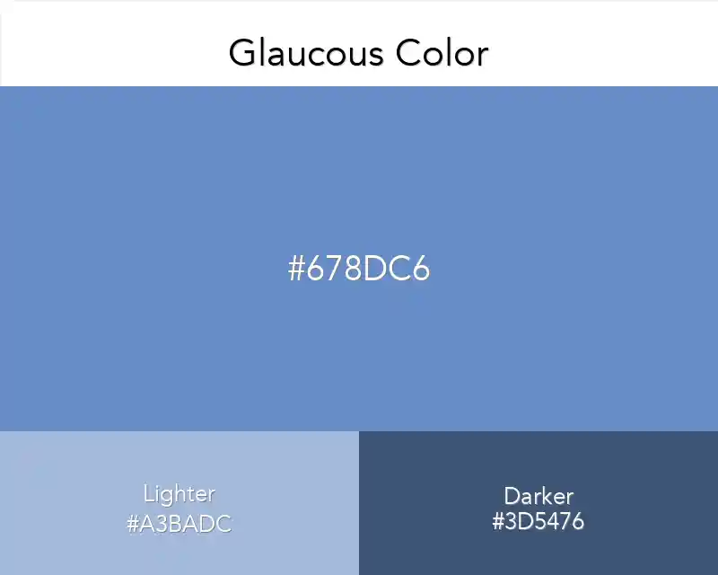
Glaucous Color
Glaucous Color
#678DC6
Tone scale
Tints
Color Conversation
Turn one color into a system.
ProUnlimited palettes, token exports, brand kits and team libraries.
Color harmony
Accessibility
Dark text
4.95:1
White text
3.39:1
Glaucous Color
Tone scale
Tints
Color Conversation
Unlimited palettes, token exports, brand kits and team libraries.
Color harmony
Dark text
4.95:1
White text
3.39:1
The Glaucous color combines calming shades of blue and green, adding confidence, elegance and modernity to designs.
Glaucous (#678DC6) brings peace and confidence to designs with its combination of blue and green tones.
How the Color Glaucous Strengthens Your Designs?
This color is ideal for conveying a message of trustworthiness, especially in trust-based industries such as healthcare, finance and education.
Digital Uses: Glaucous improves user experience by increasing visibility when used in headlines and buttons. It's also a great choice to give your designs a calm and professional feel.