Unlimited palettes, token exports, brand kits and team libraries.
Color harmony
Selected palette
Accessibility
Aa
Dark text
11.44:1
AAA
Aa
White text
1.47:1
Fail
Try it in a UI
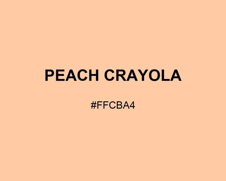
Crayon-box warmth keeps #FFCBA4 visibly orange-pink across a broad area, giving Peach Crayola more character than pale beige without the sweetness of blush.
Apricot extends the soft fruit range without erasing Peach Crayola’s pink edge. For headings, Blue Gray adds a cooler structure than black.
Peach Crayola sits closer to coral than Peach Puff, yet it remains softer than a standard orange. That middle position helps it connect warm pink and yellow accents.
A large block of Peach Crayola feels friendly without turning sugary. It fits activity cards, illustrated maps, and café menus. On children's labels, it remains visible where plain cream disappears.