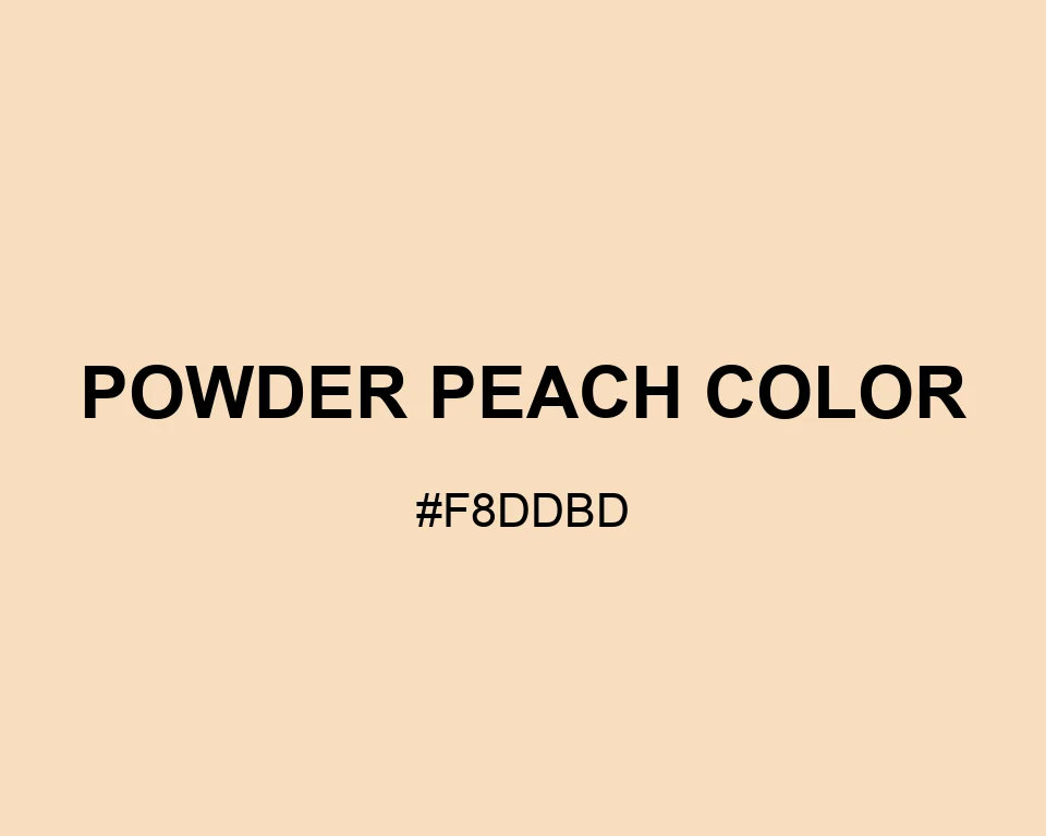
Put Powder Peach Color behind black type and the result feels easy, not sweet. Its dry apricot tone works nicely in editorial spreads and quiet product pages. Olive and clay are especially good companions here.
Tints
#f8ddbd
#f9e0c4
#f9e4ca
#fae7d1
#fbebd7
#fceede
#fcf1e5
#fdf5eb
#fef8f2
#fefcf8
#ffffff
Shadows
#f8ddbd
#dfc7aa
#c6b197
#ae9b84
#958571
#7c6e5e
#63584c
#4a4239
#322c26
#191613