Learn about puce, a deep, elegant shade between brown and dark red. Discover its rich history, complementary palettes, and how to incorporate it into your next design.

Real Design Examples 👇🏽

Color Combinations


#c62628


#dc8645


#f9c358


#e491a6


#81bf7a


Patterns

No items found.

Best Match

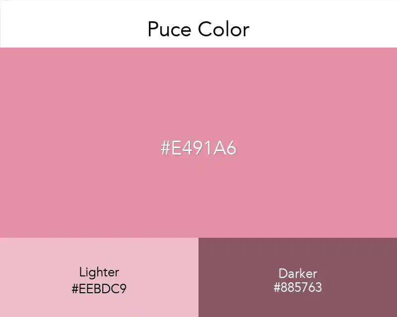
Puce Color
#e491a6
No items found.

Tints


#e491a6


#e69cae


#e9a7b7


#ecb2c0


#eebdc9


#f1c8d2


#f4d3db


#f6dee4


#f9e9ed


#fcf4f6


#ffffff


Shades


#e491a6


#cd8295


#b67484


#9f6574


#885763


#724853


#5b3a42


#442b31


#2d1d21


#160e10


#000000


Triadic


#e491a6


#a6e491


#91a6e4


Monochromatic


#d55474


#da6885


#df7d95


#e491a6


#e9a5b7


#eebac7


#f3ced8


Analogous


#e491a6


#e4a691


#e491d0


Complementary


#e491a6


#91e4cf
 

‍

Puce Color

Puce is a deep shade of pink that conveys sophistication and old-world elegance. It can add remarkable touches in both modern and vintage designs.
Used carefully in UI designs, it gives a sophisticated and warm feel. Especially when combined with light cream tones and green, great results can be achieved.
But beware! 😄 Overuse can create a moody atmosphere, not a nostalgic one!