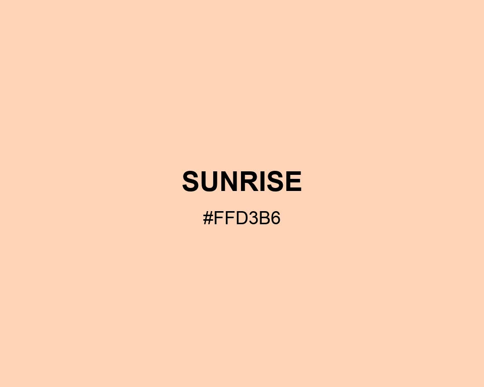
Sunrise works best when a design needs warmth without obvious color. Use it with soft gray, muted blue, and one deeper coral detail.
Sunrise
Tone scale
Tints
Color Conversation
Color harmony
Dark text
12.17:1
White text
1.38:1
A barely-there peach, like the first light in a clear sky.
Sunrise works best when a design needs warmth without obvious color. Use it with soft gray, muted blue, and one deeper coral detail.