Vivid Burgundy adds energy to wine-red palettes without becoming pink. Use navy for a crisp counterpoint or soft gray for a more editorial result.
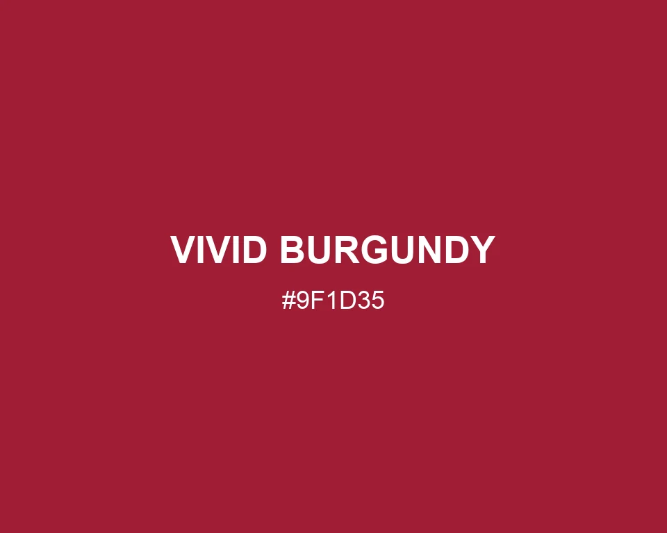
Vivid Burgundy
Tone scale
Tints
Color Conversation
Color harmony
Dark text
2.16:1
White text
7.77:1
Burgundy with its berry note turned up.