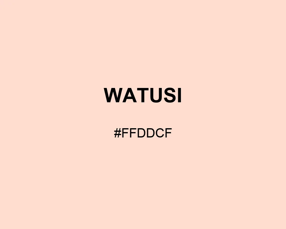
Watusi holds more peach than cream, but only just. Its red lead is visible beside white and almost disappears beside salmon.
| Color model | Value | Common use |
|---|---|---|
| HEX | #FFDDCF | Web and interface color |
| RGB | rgb(255, 221, 207) | Digital screens |
| HSL | hsl(18, 100%, 91%) | Hue-based adjustments |
| HSV | hsv(18, 19%, 100%) | Color pickers |
| CMYK | 0%, 13%, 19%, 0% | Print reference |
#ffddcf
#2e8b57
#a8d1be
#315344
#ffddcf
#65000b
#b56f77
#361c20
#ffddcf
#e6e6fa
#938aa8
#4b4659
#ffddcf
#008080
#8dc6c1
#204644
Watusi can separate a pale illustration from a white canvas without drawing a visible box around it. The effect depends on proximity; alone, the swatch may simply read as warm white.
Its RGB channels are 255, 221, and 207. Blue trails green by fourteen. In #FFDDCF, that modest final step keeps the peach cast quieter than a standard coral.
A line of rosewood adds age and definition. Pale lavender makes the orange undertone easier to spot. Sea green gives the set a clean, watery counterweight.

#ffddcf
#ffe0d4
#ffe4d9
#ffe7dd
#ffebe2
#ffeee7
#fff1ec
#fff5f1
#fff8f5
#fffcfa
#ffffff
#ffddcf
#e6c7ba
#ccb1a6
#b29b91
#99857c
#806e68
#665853
#4c423e
#332c29
#1a1615
#ffddcf
#ffffff
#ffffff
#a69087
#d1b5aa
#ffddcf
#ffe3d8
#ffe9e0
#ffffff
#ffddcf
#ffffff
#ffddcf
#ffffff