Unlimited palettes, token exports, brand kits and team libraries.
Color harmony
Selected palette
Accessibility
Aa
Dark text
15.61:1
AAA
Aa
White text
1.07:1
Fail
Try it in a UI
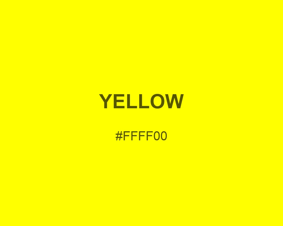
At full screen brightness, Yellow behaves more like a beam of light than a golden surface. It can anchor a focal point, but it needs darker framing to keep the rest of the composition legible.
Put Yellow on a small marker and it is hard to miss; spread it across every panel and the eye has nowhere to settle. Its strength is direction, so reserve it for the one detail that should lead.
Set Yellow beside Northwestern Purple for direct complementary contrast. A restrained Storm Cloud nearby gives the eye somewhere to rest without turning the palette into a warning sign.
Black lettering holds its edge on Yellow; white does not. Keep body copy off the swatch and check contrast again if the background becomes translucent or shifts toward a softer tint.