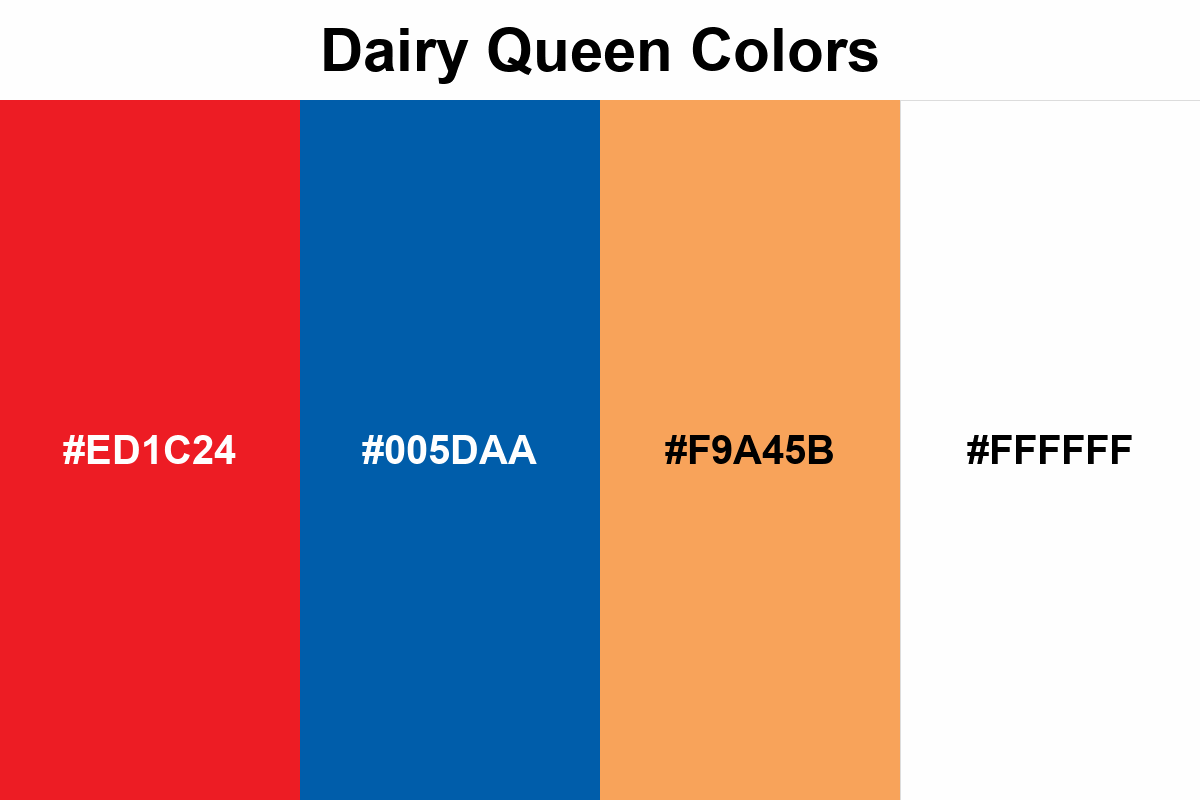
Dairy Queen Colors
Dairy Queen colors create a visual balance that doesn't take ice cream seriously but takes the brand seriously.
Dairy Queen's color palette aims to create contrast and movement in the brand identity.
Red draws attention while blue provides balance, and orange softens the palette and makes it more playful.
This combination gives the brand both a classic and dynamic look.