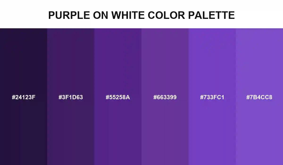
Purple on White Color Palette

Six purples turn white space into a measurable design constraint, moving from enhanced contrast body text to lighter AA-compliant accents without leaving the hue family.
#24123F
#3F1D63
#55258A
#663399
#733FC1
No items found.

Purple on White Color Palette treats white as a test surface rather than empty space. Night Plum, Deep Aubergine, Royal Ink, and RebeccaPurple produce contrast ratios from 17.03:1 to 8.41:1 on pure white, clearing WCAG's enhanced threshold for normal text.

Action Purple and Open Violet create lighter levels at 6.54:1 and 5.66:1. Both still clear the 4.5:1 Level AA minimum for normal text, making them useful for links, controls, or emphasis when the darker shades would carry too much visual weight.

The measurements apply to these exact opaque values on #FFFFFF. Recalculate after changing opacity, background, gradient, or state, and never use purple alone to communicate meaning. Contrast is a property of the final pair, not a permanent quality of one swatch.

Purple on white color palette with six accessible dark-to-light purple HEX values tested against white
Build with ❤️ Anything