Unlimited palettes, token exports, brand kits and team libraries.
Color harmony
Selected palette
Accessibility
Aa
Dark text
12.07:1
AAA
Aa
White text
1.39:1
Fail
Try it in a UI
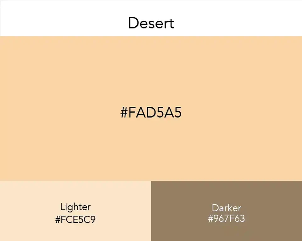
A chalky apricot that borrows character from whatever sits beside it: limestone makes it dusty, polished wood brings out the peach, and cool daylight pulls it toward cream.
No items found.
Best Match
Desert
#FAD5A5
No items found.
Look at Desert beside an actual material sample and it stops being a generic beige. On limestone it reads almost chalky; next to oak, the peach note comes forward. That small shift makes it useful for interiors where one fixed paint color has to live through changing daylight.
For a built palette, Terracotta gives the pale surface a fired-clay anchor. A touch of Slate Gray cools the arrangement like a stone threshold beside sunlit plaster.
Desert can cover a page, a label, or a wall without competing with the object in front of it. Its limitation is equally practical: fine lettering fades against it, so choose a dark ink before setting type rather than trying to rescue the contrast afterward.