Pastel Orange
August 10, 2025
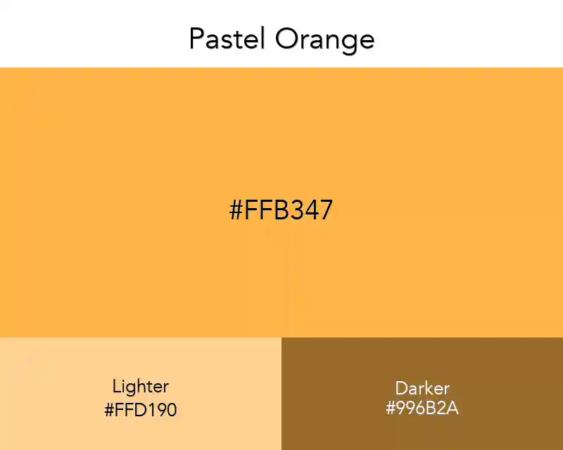
Pastel Orange color is the most preferred tone among pastel colors. I do not know the reason. Maybe because it reflects the light well. Maybe there's another reason.
No items found.
#ffb347
rgb(255,179,71)
Color Conversions
Real Design Examples 👇🏽
Color Combination
Palettes
Other Color Collections
Fashion
No items found.
Interior
No items found.
Wallpapers
No items found.
Patterns
No items found.
Best Match
Tints
Shades
Triadic
Monochromatic
Analogous
Complementary
You've probably heard of a lot of colors in the past, but what about Pastel Orange Color? Did you know that before the Golden Age (Color Age), the pastel orange color was used in ancient Egyptians' tombs and earthenware.
This color has been a source of fascination for several painters and painters who were regarded as the best in this history. Then, with the emergence of various shades of orange color that had caused hysteria with fans. They are so-called ''orange-colored'' or 'golden colors'.
Related: Pastel Gradients