Light Turquoise feels clear and open rather than icy. It works well behind ink blue type, soft gray details, or a single deep teal accent.
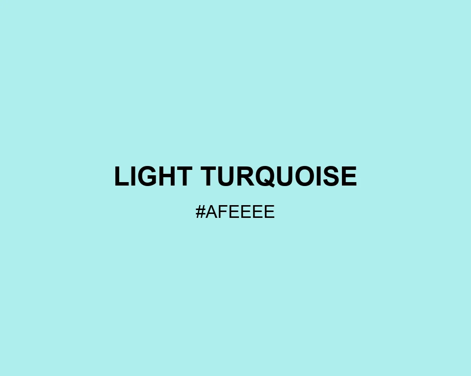
Light Turquoise
Tone scale
Tints
Color Conversation
Color harmony
Dark text
13.00:1
White text
1.29:1
A light aqua that leaves plenty of room for a layout to breathe.
Light Turquoise feels clear and open rather than icy. It works well behind ink blue type, soft gray details, or a single deep teal accent.