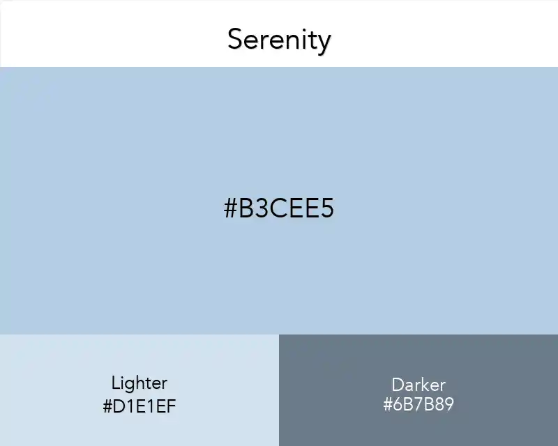
Serenity
August 12, 2025
The color Serenity is a symbol of peace and serenity. Ideal for adding softness and calmness to your design, I suggest you try Serenity with pastel shades and warm colors.
#B3CEE5
rgb(179,206,229)
Color Conversions
Real Design Examples 👇🏽
Color Combinations

Palettes
Other Color Collections
Fashion
No items found.
Interior
No items found.
Wallpapers
No items found.
Patterns
No items found.
Best Match
Serenity
#B3CEE5
No items found.
Chosen as the 2016 Pantone Color of the Year, this shade reflects balance and prosperity, especially when combined with Rose Quartz.
Perfect with blue, purple and pastel shades, Serenity is ideal for evoking a sense of confidence and calm in your designs.
It also creates an energetic contrast when used with warm colors. 💙