Ochre Color

No items found.
rgb(204,119,34)
#cc7722

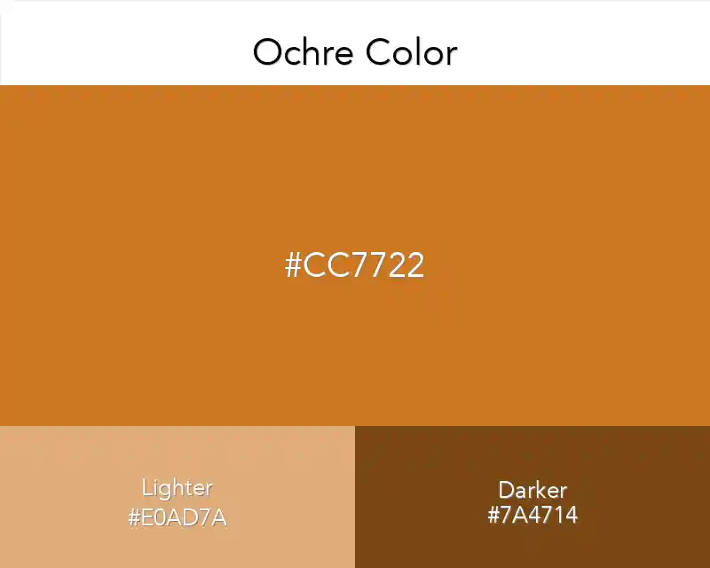
Ocher color is a darker type of yellow. Dark and moody. Natural colour. The minerals in it caused this color to emerge. Very cool.

Best Combination

#cc7722
Ochre Color
Ochre Color

Ochre color, or "ochre" refers to a group of natural earth pigments containing hydrated iron oxide. Since the commercial development of ochre pigment in the 19th century it has been used by artists, initially to create their own colors in place of rare and expensive natural equivalents, but subsequently to produce brighter colors. 

As well, ochre in its raw form has long been used by potters and other artists across cultures for their clay bodies.

There are some distinct advantages to painting with ochre. One set of people who painted with ochre were the indigenous people of the Kalahari Desert in Southern Africa. 

They collected pigment from surface deposits of iron or ferric oxides, then ground it and mixed it with a plant gum for binding.

En ochre color  is one of the colors you can use for your traffic lights. This is a very bright shade of yellow, but it is not as bright as lemon yellow. If you see an ornate room painted in this color, you will notice that it is also characterized by heavy chandeliers which are placed on top of marble tables.  

When you look closer, you will see that it has a very distinct pattern similar to tribal art. The possible decoration items need not be limited to wood or fabric alone. 

Large mirrors can be placed alongside wooden sideboards to reflect this color beautifully.

Ochre Color in Interior Design

Ochre is considered as one of the oldest colors known to mankind and possibly the first to be used for painting. It is derived from ochres, which are natural earth pigments composed chiefly of hydrous iron oxide occurring in various shades of yellow, red, brown, and orange. 

The ochre color takes you to the extent of elegance, classiness and nobility. 

Whether it's about wall paint, floor tiles or textiles like upholstery and curtains it gives a high professional look to your interiors and connects well with all kinds of decorating styles.

Living in the modern world has its advantages. With the advancement of technology, you can have just about everything that you wish for. 

You just have to have enough money to get it done. Nevertheless, there are things that are more important than just inventions. 

Some of these things are also improving your living situation and surroundings. One of the most vital parts of your home would be your living room. 

It is not weird if you focus most of your attention on this room because it is equally as important as the other components inside your home such as the kitchen and bedroom.

Once you’ve decided whether to let your interior design ideas run wild or keep them somewhat subdued, you need to select the best ochre paint color. 

You can either use this decision as an opportunity to make a bold statement or keep things simple with neutral colors. 

Either way, you’ll need to know why ochre covers all of these bases and how it’s the best paint color choice. 

Ochre Color in Fashion Design

It’s different from most colors because it is common in nature, but it has been incorporated into the fashion trends of the human race. In this article, you will find out something special about ochre color in fashion Design.

It looks expensive and has an elegance all its own. It uses golden brown hues that are seen to best advantage on hair, skin, fabric, exterior décor and furniture. The color brings about a persona of earthiness along with authenticity.

A couple of years ago, Gina Laurie's Living Color book on how to work color into your wardrobe was one of my 'go-to' go-to references for making the most of what I already owned and shopping for new items to expand my colorspace. 

Because ochre wasn't a word we were using in our personal or professional wardrobes at the time (we tend to be trendsetters). Laurie broke down her 4 color categories (earth tones, pastels, accent colors and primary colors) and provided names and solids (less is more) and prints (more is more) that work best with those palettes. 

Copied👏
Made ın webflow