Burnt Orange
August 10, 2025
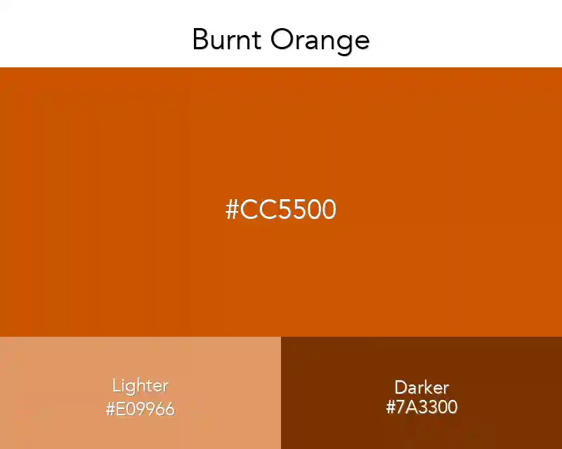
Burnt orange, I think one of the most refreshing orange shades. Although there is much coolers color around there, it's at least the top of the orange class.
No items found.
#cc5500
rgb(204,85,0)
Color Conversions
Real Design Examples 👇🏽
Color Combination
Palettes
Fashion
No items found.
Interior
No items found.
Wallpapers
No items found.
Patterns
No items found.
Best Match
Tints
Shades
Triadic
Monochromatic
Analogous
Burnt Orange Complementary Colors
Burnt orange is a brighter orange with red undertones. If you want to give your design an energetic boost, then the burnt orange color is one of the best choices for you. It brings out more energy and enthusiasm to your design work.
That same spirited feeling can also be captured by using this particular shade of orange for a brand logo or website design theme.
Related: Orange Gradients