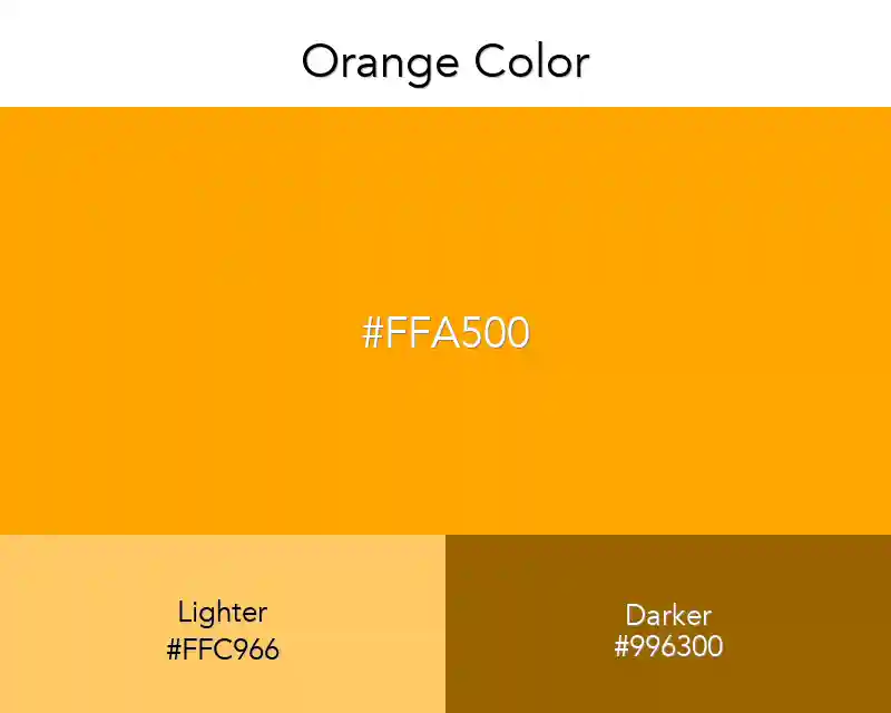
Orange Color
August 10, 2025
Orange color, yellow to dark, red to light, is a beautiful color. I especially like orange berets. Feel free to use this color.
#ffa500
rgb(255,165,0)
Color Conversions
Real Design Examples 👇🏽
Color Combination
Other Color Collections
Fashion
No items found.
Interior
No items found.
Wallpapers
No items found.
Patterns
No items found.
Best Match
Tints
Shades
Triadic
Monochromatic
Analogous
Orange Complementary Colors

We all want to know how to use orange color in the best possible way. Although orange is never as popular as its counterparts blue, green, or red, it still has its place on the color map and can be used in various situations.
Orange draws attention, it is very noticeable and is often used for warning signs. At the same time, it is a vivid and friendly color and people tend to associate it with a happy environment, so designers are using this connection in their work quite often.
Related: Orange Gradients, all orange colors