Unlimited palettes, token exports, brand kits and team libraries.
Color harmony
Selected palette
Accessibility
Aa
Dark text
8.49:1
AAA
Aa
White text
1.97:1
Fail
Try it in a UI
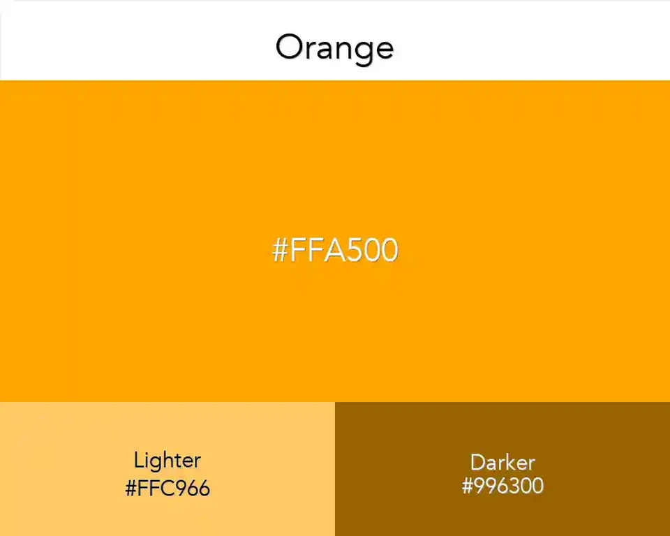
Orange is the color that gives a warm palette its point of arrival: softer yellows lead toward it, then rust and red carry the eye onward. #FFA500 sits at the clear, uncomplicated center of that passage.
In a color sequence, Orange acts as a hinge rather than a destination. Place yellow before it and the transition feels sunlit; follow it with red and the same swatch begins to feel hotter. This makes it handy for diagrams or illustrations that need a readable path through warm hues.
For a split-temperature palette, set Orange against Azure; the blue keeps the warm section from closing in on itself. Coral continues the warm route with a softer, pinker turn.
The standard web value is easy to reproduce on screen, but the broad label Orange covers many different inks and paints. If matching a physical reference matters, use #FFA500 as the digital target and make a small print proof before approving the final color.