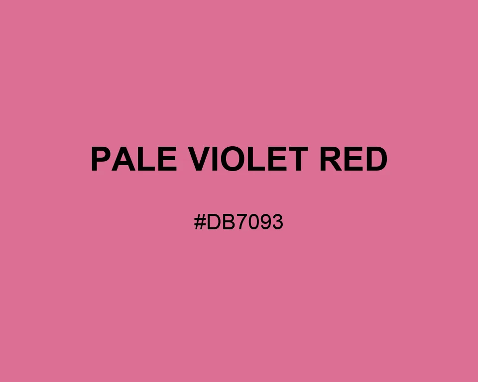
Pale Violet Red
Tints · 950
Pale Violet Red
#DB7093
HEX
Tone scale
Tints
Color Conversation
Color harmony
Accessibility
Aa
AADark text
5.39:1
Aa
AA LargeWhite text
3.11:1
Pale Violet Red
Tone scale
Tints
Color Conversation
Color harmony
Dark text
5.39:1
White text
3.11:1
Pale Violet Red #DB7093 reads like worn rose fabric, not violet paint. It carries more weight than blush and less heat than hot pink.
| Color model | Value | Common use |
|---|---|---|
| HEX | #DB7093 | Web and interface color |
| RGB | rgb(219, 112, 147) | Digital screens |
| HSL | hsl(340, 60%, 65%) | Hue-based adjustments |
| HSV | hsv(340, 49%, 86%) | Color pickers |
| CMYK | 0%, 49%, 33%, 14% | Print reference |
#db7093
#254c3e
#a9c7b8
#faf5eb
#db7093
#68433a
#d8b2a7
#f4e1d8
#db7093
#573057
#b28ab2
#fff4f7
#db7093
#262329
#e8c8d2
#ffffff
The name points one way; the eye goes another. Pale Violet Red looks much more like dusty rose than violet.
At #DB7093, the RGB channels read 219, 112, 147.
Pine green gives the rose a botanical setting, cocoa makes it feel earthy, and plum draws out the cooler edge.
Picture worn velvet, faded lipstick, or a printed flower that has lost a little saturation.
That material quality suits invitations, fabric graphics, beauty charts, and book details.
#db7093
#df7e9e
#e28da9
#e69bb3
#e9a9be
#edb8c9
#f1c6d4
#f4d4df
#f8e2e9
#fbf1f4
#ffffff
#db7093
#c56584
#af5a76
#994e67
#834358
#6e384a
#582d3b
#42222c
#2c161d
#160b0f
#db7093
#81db56
#5681db
#8e4960
#b45c79
#db7093
#e18aa6
#e8a2b9
#db56c4
#db7093
#db6d56
#db7093
#56dbaf