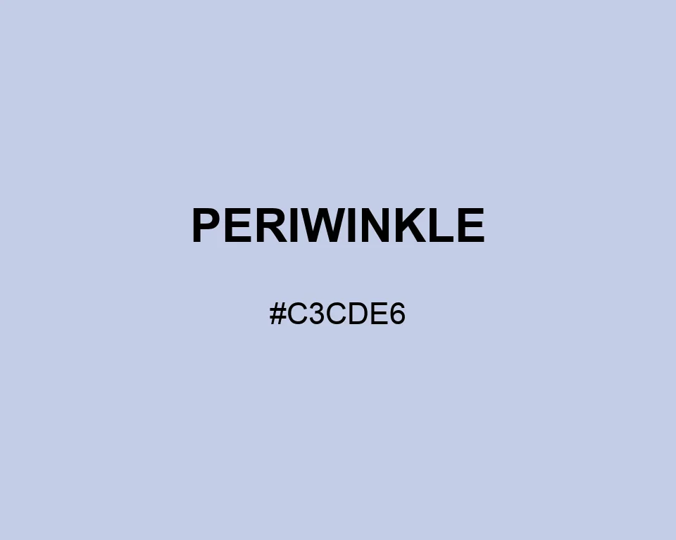
Periwinkle sits between faded blue stationery and a lavender wash. Neither side wins. That balance is its appeal.
| Color model | Value | Common use |
|---|---|---|
| HEX | #C3CDE6 | Web and interface color |
| RGB | rgb(195, 205, 230) | Digital screens |
| HSL | hsl(223, 41%, 83%) | Hue-based adjustments |
| HSV | hsv(223, 15%, 90%) | Color pickers |
| CMYK | 15%, 11%, 0%, 10% | Print reference |
#c3cde6
#000080
#7e89b1
#fafaf6
#c3cde6
#f88379
#d7a2a7
#4a3439
#c3cde6
#36454f
#9ba7b2
#f4f5f7
#c3cde6
#68795d
#b5c1a5
#334035
Misty Blue continues Periwinkle toward a quieter sky tone. A pinpoint of Coral can mark an active chart value or tab without warming the whole system.
Periwinkle can fill a large panel without making it feel cold. On cotton it resembles a blue dye after several washes; on a glossy screen, the lavender note is easier to notice.
Periwinkle is bluer than lavender and quieter than cornflower. Placing those neighbors together makes its balanced blue-violet character easier to judge before choosing a broader palette.
#c3cde6
#c9d2e8
#cfd7eb
#d5dcee
#dbe1f0
#e1e6f2
#e7ebf5
#edf0f8
#f3f5fa
#f9fafc
#ffffff
#c3cde6
#b0b8cf
#9ca4b8
#8890a1
#757b8a
#626673
#4e525c
#3a3e45
#27292e
#141417
#c3cde6
#c01243
#44c012
#7f8596
#a0a8bd
#c3cde6
#ced6ea
#d8deef
#129bc0
#c3cde6
#3712c0
#c3cde6
#c08f12