For a logo handoff, include a filled swatch and its numeric value in the style sheet; a name alone leaves room for interpretation. If the intended accent is visibly more purple, Plum vs Burgundy is the next comparison to check.
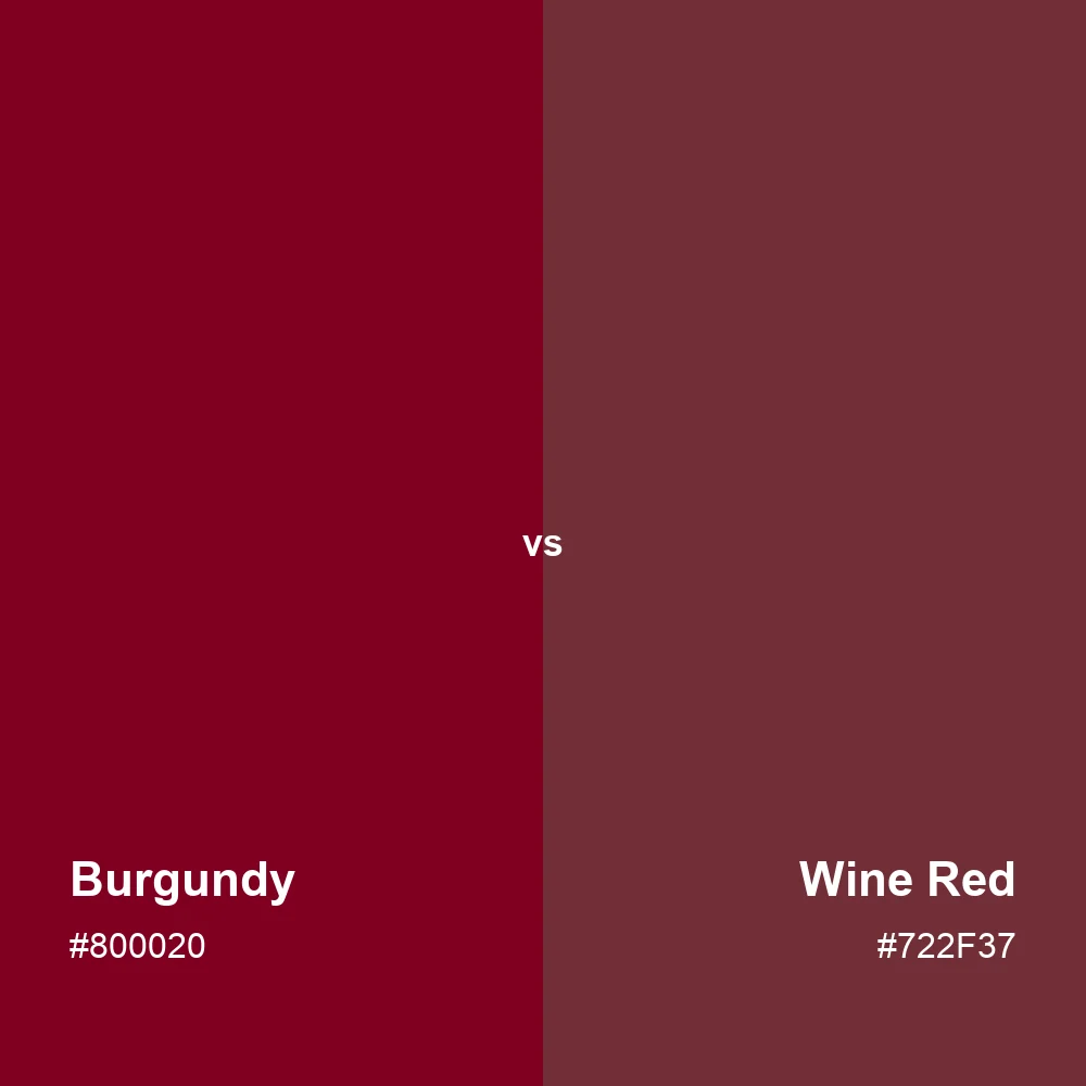
In these swatches, burgundy is the more saturated red. Wine red has a softer, browner appearance.
Decorative pairing only
AA text: 4.5:1 minimum. Large text: 3:1.For a logo handoff, include a filled swatch and its numeric value in the style sheet; a name alone leaves room for interpretation. If the intended accent is visibly more purple, Plum vs Burgundy is the next comparison to check.