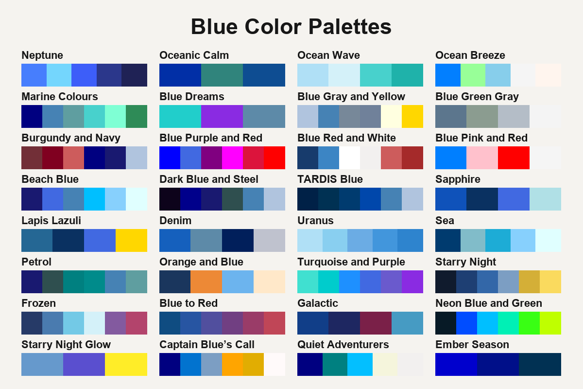
32 Blue Color Palettes
See how blue reads beside white, warm reds and muted greens, from pale coastal combinations to deep navy.
Put the blue swatch next to its nearest neutral first. In Ocean Wave, the palest blue makes the turquoise easier to pick out. In Burgundy and Navy, the two dark colors are closer in lightness, so the pale steel blue creates the clearest break. Blue Gray and Yellow uses a warm accent for that same role.
If you need a softer backdrop, look through the soft blue palettes. For combinations that put the darkest swatch first, try navy blue palettes.