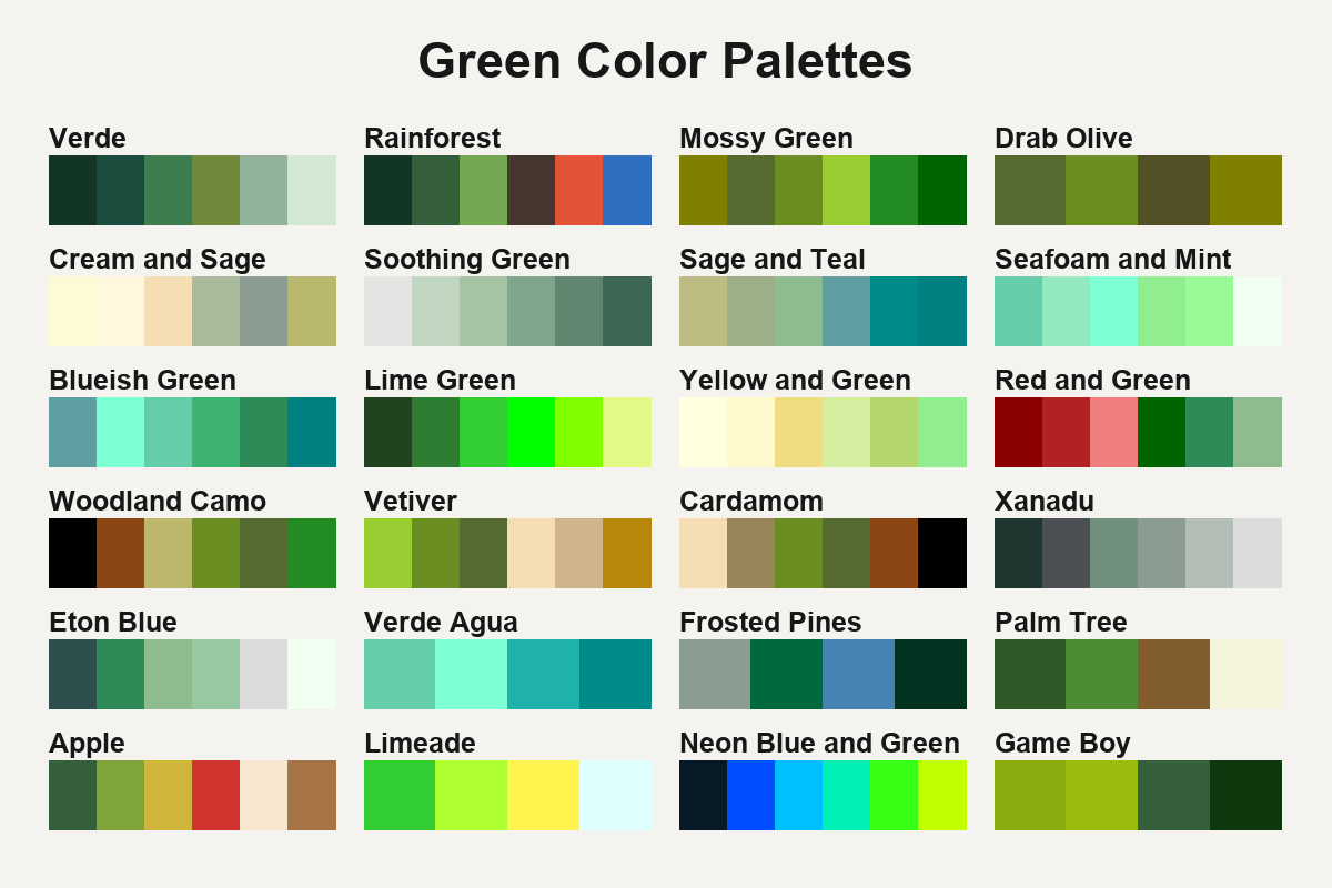
24 Green Color Palettes
Green can pull a palette toward warm khaki, cool seafoam or sharp lime. These combinations show what changes when its neighboring colors shift.
Choose the green by the job it needs to do. If it covers most of the design, the muted greens in Cream and Sage leave room for other details. When green needs to stand out, the Lime Green palette sets its brightest swatches against deeper leaf tones. For a cooler direction, compare the blue cast of Seafoam and Mint with the yellow-greens in the Light Yellow and Green palette.
The olive green palettes offer deeper, earthier combinations. The blue-green palettes give you more options near teal.