For a wider selection beyond these eight schools, browse our university colors collection.
Digital color references at a glance
| University | Selected color | HEX |
|---|---|---|
| Harvard | Crimson | #A51C30 |
| Yale | Yale Blue | #00356B |
| Princeton | Orange — Site Builder reference | #E77500 |
| Penn | Penn Red / Penn Blue | #990000 / #011F5B |
| Columbia | Columbia Blue — SIPA reference | #B9D9EB |
| Dartmouth | Dartmouth Green | #00693E |
| Brown | Brown / Red — 2016 identity policy | #4E3629 / #ED1C24 |
| Cornell | Cornell Red | #B31B1B |
These are selected references, not complete palettes. A school, department or athletics program may publish its own guidance. HEX values describe digital colors; print work needs the appropriate print specifications.
Harvard University — Crimson #A51C30
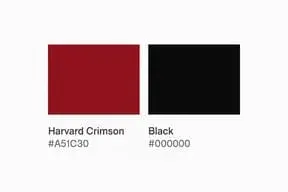
Harvard's primary colors include a crimson that is recognizable well beyond campus. The digital reference here is #A51C30. Against Black, it forms a dark pairing; a white surrounding field gives the red more room.
The history runs from rowing handkerchiefs to later color decisions. Our Harvard Crimson guide follows those events and separates the official color from related reds. For a separate color study, a Crimson swatch is a comparison, not a replacement for the specified Harvard shade.
Yale University — Yale Blue #00356B
Yale Blue
#00356B
Yale Blue is a deep blue in the university’s web identity. Its dark surface gives pale lettering a clear surrounding field. Our colors of Yale palette offers supporting shades for a broader color study. A green accent in a palette study is a different choice from Yale’s core color.
Princeton University — Orange and Black
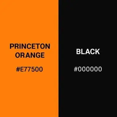
Princeton pairs orange with black. Its Site Builder Tiger theme documents #E77500 for the orange; use the current guide for your particular project if it specifies another production value.
Princeton orange gives this pairing a brighter warm area than Harvard’s deep red. Princeton’s color history records the official adoption of orange and black in 1896. The colors of Princeton put a bright orange field beside a much darker one.
University of Pennsylvania — Red #990000 and Blue #011F5B

Pennsylvania has two primary colors: Penn Red and Penn Blue. Both are deep shades. In a small graphic, give each a clear area rather than expecting a thin red line to stand out against the blue.
Penn’s logo standards distinguish digital values from print references. White space around a red-and-blue mark helps its edges stay clear.
Columbia University — Columbia Blue #B9D9EB
Columbia Blue
#B9D9EB
Columbia Blue brings a much lighter blue into this group. Columbia’s identity guidance identifies Pantone 290, while SIPA’s digital guide supplies #B9D9EB. This pale field behaves differently from Yale’s dark blue: dark lettering remains visible where white lettering may not. Supporting blues depend on the Columbia unit’s guide.
Dartmouth College — Green #00693E
Dartmouth Green
#00693E
Forest Green — secondary
#12312B
The Dartmouth College guide distinguishes Dartmouth Green (#00693E) from the darker secondary Forest Green (#12312B). Use the deeper shade for a darker supporting area. Compared side by side, Forest Green approaches a dark neutral while Dartmouth Green shows more of its green hue.
Brown University — Brown and Red
Brown
#4E3629
Red — 2016 identity policy
#ED1C24
The Brown University color combination puts an earthy brown beside a bright red. Brown’s 2016 university identity policy specifies #4E3629 and #ED1C24.
Check the unit before choosing a red. Brown Engineering’s published guide lists #C00404. That is a different reference, so keep the source and the intended use together rather than combining values from several guides.
Cornell University — Red #B31B1B
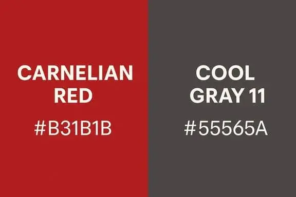
Cornell University's characteristic palette centers on a strong red. Cornell CALS documents #B31B1B, with white and black in its main palette.
The gray in the illustration is a supporting comparison. White gives the red a lighter setting; the gray illustration shows a darker alternative.
Comparing the palettes
- Dark colors: Yale Blue and Penn’s red-blue pair need enough light space around small details.
- Light colors: Columbia Blue benefits from dark text when used as a pale field.
- Strong pairs: Princeton’s orange and black rely on both hue and light-dark contrast.
Try the same layout with two different university palettes before changing the typography. Keeping the shapes fixed makes the differences in their shades easier to see.