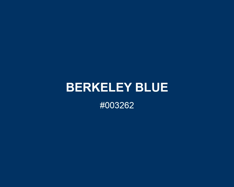
At a glance, Berkeley Blue can read almost like ink. The blue becomes easier to see across a broad panel. A report cover in this shade has depth without a flat black finish.
Cream lettering is a good choice here. Leave the border unadorned, or add a single ochre rule beneath the title if the cover needs a warmer note.