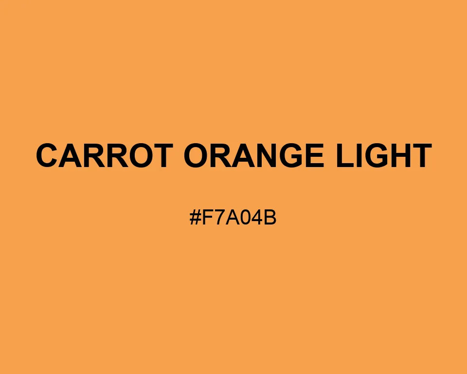
This is the punchiest color in the group. Carrot Orange Light reads clearly from a distance. A measured dose is usually enough.
| Color model | Value | Common use |
|---|---|---|
| HEX | #F7A04B | Web and interface color |
| RGB | rgb(247, 160, 75) | Digital screens |
| HSL | hsl(30, 91%, 63%) | Hue-based adjustments |
| HSV | hsv(30, 70%, 97%) | Color pickers |
| CMYK | 0%, 35%, 70%, 3% | Print reference |
#f7a04b
#263238
#fff4de
#9d5b24
#f7a04b
#0047ab
#a9c4e8
#162b4d
#f7a04b
#8b9c90
#d8dec9
#4c594d
#f7a04b
#000080
#f4d28d
#17172f
A small square of Carrot Orange Light can organize a whole information panel. It is bright, but not fluorescent. The yellow content keeps it friendlier than red-orange.
Pumpkin Orange creates a darker step for tabs and arrows. Across the color wheel, Prussian Blue gives those signals a firm graphic boundary.
Treat Carrot Orange Light as a directional accent, not a reading surface. Tabs, arrows, price marks, and short badges gain energy from it; long text areas become tiring.

#f7a04b
#f8aa5d
#f9b36f
#f9bc81
#fac693
#fbd0a5
#fcd9b7
#fde2c9
#fdecdb
#fef6ed
#ffffff
#f7a04b
#de9044
#c6803c
#ad7034
#94602d
#7c5026
#63401e
#4a3016
#31200f
#191008
#f7a04b
#dcf7e9
#e9dcf7
#a16831
#cb833e
#f7a04b
#f8b16b
#fac18a
#f7dcdc
#f7a04b
#f7f7dc
#f7a04b
#dce9f7