Crimson
Tints · 950
Crimson
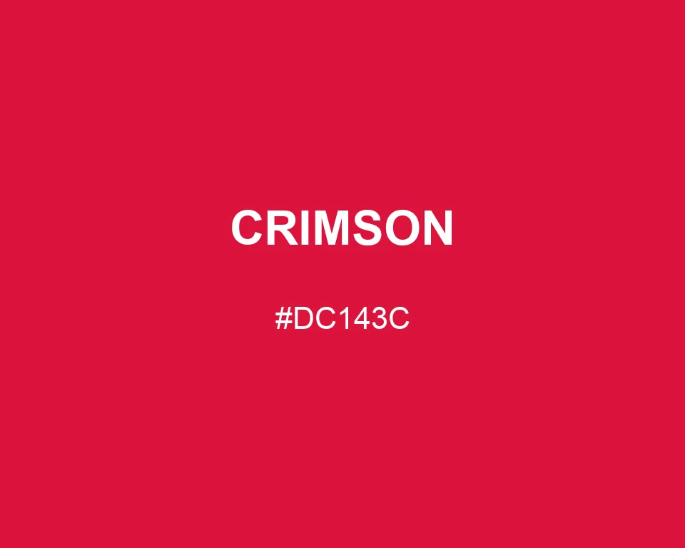
#DC143C
HEX
Tone scale
Tints
Color Conversation
Color harmony
Accessibility
Aa
AA LargeDark text
3.36:1
Aa
AAWhite text
4.99:1
Crimson
Tone scale
Tints
Color Conversation
Color harmony
Dark text
3.36:1
White text
4.99:1
Crimson #DC143C has the weight of velvet and the clarity of a warning mark. Its small blue bias separates it from plain red.
| Color model | Value | Common use |
|---|---|---|
| HEX | #DC143C | Web and interface color |
| RGB | rgb(220, 20, 60) | Digital screens |
| HSL | hsl(348, 83%, 47%) | Hue-based adjustments |
| HSV | hsv(348, 91%, 86%) | Color pickers |
| CMYK | 0%, 91%, 73%, 14% | Print reference |
#dc143c
#fff3d6
#8e1b2c
#2a2023
#dc143c
#14213d
#e5e5e5
#ffffff
#dc143c
#819171
#d8c7a8
#343a40
#dc143c
#f2a7b5
#60101f
#111111
Crimson feels closer to velvet than plastic. It has depth, but the red still reaches the eye quickly enough for a score, badge, or headline.
Its code is #DC143C, built from RGB 220, 20, and 60.
That blue contribution is small, yet it is what pulls the hue toward ruby.
Try cream instead of pure white when the page should feel warm. Navy makes the red formal; sage makes it earthy; charcoal gives it the blunt force of a newspaper front page.
#dc143c
#e02c50
#e34363
#e65a76
#ea728a
#ee8a9e
#f1a1b1
#f4b8c4
#f8d0d8
#fce8ec
#ffffff
#dc143c
#c61236
#b01030
#9a0e2a
#840c24
#6e0a1e
#580818
#420612
#2c040c
#160206
#dc143c
#c9e9c1
#c1c9e9
#8f0d27
#b41031
#dc143c
#e23e5f
#e86680
#e9c1dc
#dc143c
#e9cdc1
#dc143c
#c1e9e1