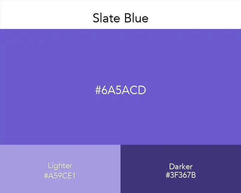
Slate Blue

No items found.
rgb(106,90,205)
#6a5acd

Slate blue is close to gray-blue but is also part of the purple color family. A little versatile color. You won't regret using it.

Best Combination

#6a5acd
Slate Blue
Slate Blue Color

The predominant theory about this color is that it’s a shade of slate gray, which is actually a mixture of white and black


However, some people believe that the true color is more of a combination of blue and green. Slate blue was created between 1850 and 1930.


Slate of blue is a striking color that comes off as oddly familiar, but you can hardly place it. Despite this, it feels at once familiar and timeless. 


Dreamy yet balanced, slate blue evokes a carefree sense of adventure while also remaining appropriate to the most formal setting. 


In fact, this light blue hue is just as often used by artists to add softness and a sense of whimsy to their work as it is by interior decorators for walls or carpeting.

Slate blue color in advertising

If you want your company to reach out to a professional audience, you might want to think about using this in advertising. 


It was first used in the 1890s by Tiffany for his store logo and became popular amongst luxury brands. 


It portrays a sense of elegance, integrity, honesty, and truthfulness. This makes it a great choice for your company to use if you are targeting high-class individuals.


A grayish blue color In photography, color reproduction is the degree to which the actual colors of an object photographed are faithfully represented by the image. 


In other words how close it comes to the photograph you’ve imagined in your head. For a photographer or a designer, color is an essential part of art. 


It helps catch and retain attention, creates harmony and balance and gives rhythm to your design. 


Colors behind a brand name, product package or logo act as a tool to connect with customers.

Slate blue color in product design

The use of this in product design is not a new concept. 


This particular color has been used for many household items over the years. Even today, the use of this color continues in different households. 

There are many sites that provide information about how this particular color came to be and what its use was in older days. 


There are also many resources available online that define the characteristics of this color, its implications, and even way it is perceived by an individual or in relation to other colors.


This tone of blue that makes a strong first impression. 


A murky and dark shade of blue, it is often associated with water and other natural elements. While it’s not the most vibrant color in the spectrum, it offers enough versatility to blend in with almost any color combination.


Slate blue is also found in some product designs, which can be used as reference for further applications.

Slate blue color in Interior Design


It can be used in modern interior design in the living room as well as bathroom. 


This color has a robust character and suits the rooms with rugged appearance. 


The other side, slate blue can also be very elegant. 


However, you have to apply this color with the appropriate lighting and furniture. 


It has a touch of gray and blue in a way that brings out the color perfectly. The variation in shades intensifies with hue. 


You will be able to find a shade of slate blue for any room in your house or space you are working on including the office, bedroom, bathroom or kitchen.

Copied👏
Made ın webflow