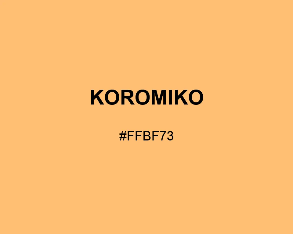
Koromiko is apricot at full daylight: golden at the center, peach around the edges, and easy to spot without looking neon.
| Color model | Value | Common use |
|---|---|---|
| HEX | #FFBF73 | Web and interface color |
| RGB | rgb(255, 191, 115) | Digital screens |
| HSL | hsl(33, 100%, 73%) | Hue-based adjustments |
| HSV | hsv(33, 55%, 100%) | Color pickers |
| CMYK | 0%, 25%, 55%, 0% | Print reference |
#ffbf73
#0047ab
#94acce
#1d304c
#ffbf73
#228b22
#98bf8b
#244127
#ffbf73
#36454f
#9ca19b
#fff6e8
#ffbf73
#008080
#91c4b7
#21423e
White type fades quickly on Koromiko. Dark lettering and simple icon shapes are more dependable, especially when the color is used for navigation, pricing, or compact labels.
Yellow Orange gives Koromiko a close, brighter companion for fruit illustrations. Yale Blue holds compact copy and lets the golden field remain dominant.
Think apricot flesh rather than orange peel. The color is light enough for a broad panel, yet it still marks a price tag or section tab clearly.
#ffbf73
#ffc581
#ffcc8f
#ffd29d
#ffd9ab
#ffdfb9
#ffe5c7
#ffecd5
#fff2e3
#fff9f1
#ffffff
#ffbf73
#e6ac68
#cc995c
#b28650
#997345
#80603a
#664c2e
#4c3922
#332617
#1a130c
#ffbf73
#ffffff
#ffffff
#a67c4b
#d19d5e
#ffbf73
#ffcb8c
#ffd5a4
#ffffff
#ffbf73
#ffffff
#ffbf73
#ffffff