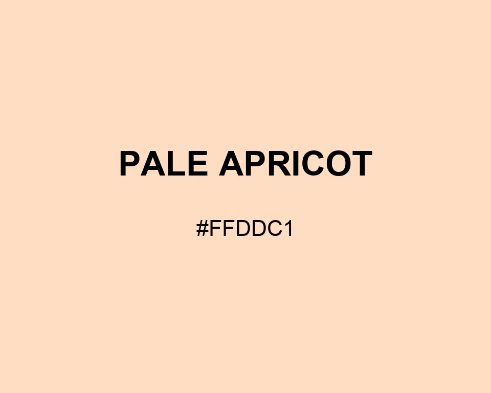
Less pink than blush and lighter than ripe apricot, #FFDDC1 behaves like warm daylight on paper. Its orange content is quiet but readable.
| Color model | Value | Common use |
|---|---|---|
| HEX | #FFDDC1 | Web and interface color |
| RGB | rgb(255, 221, 193) | Digital screens |
| HSL | hsl(27, 100%, 88%) | Hue-based adjustments |
| HSV | hsv(27, 24%, 100%) | Color pickers |
| CMYK | 0%, 13%, 24%, 0% | Print reference |
#ffddc1
#693d58
#b18299
#3a2732
#ffddc1
#79af99
#c0dccd
#36584a
#ffddc1
#667fae
#afbfdc
#35425e
#ffddc1
#9b5b3f
#d39a7d
#533527
This page uses Pale Apricot for one specific digital swatch. The name does not imply a universal formula. On screen, it sits between cream and peach with very little visual weight.
Think of #FFDDC1 as white with channel space removed: none from red, 34 levels from green, and 62 from blue. That RGB pattern leaves a pale apricot glow instead of a neutral cream.
Across recipe margins, nursery illustrations, or a small product card, pair Plum for depth with mint green for a cleaner, cooler cue.

#ffddc1
#ffe0c7
#ffe4cd
#ffe7d4
#ffebda
#ffeee0
#fff1e6
#fff5ec
#fff8f3
#fffcf9
#ffffff
#ffddc1
#e6c7ae
#ccb19a
#b29b87
#998574
#806e60
#66584d
#4c423a
#332c27
#1a1613
#ffddc1
#ffffff
#ffffff
#a6907d
#d1b59e
#ffddc1
#ffe3cc
#ffe9d7
#ffffff
#ffddc1
#ffffff
#ffddc1
#ffffff